Year-wise population graph using Scrapy
Explore the trends in world population over the years yourself using a bit of code.
web scraping python scrapy
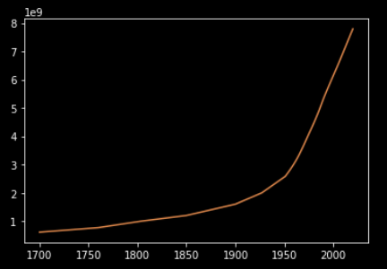
I have always been amazed by phenomena like entropy and chaos. At the same
time, I feel pleased while seeing straight lines and symmetric curves. So, I
love to find patterns in chaos. Have you heard about the
Bell curve
? Almost
every natural phenomena if studied a long time follows the Bell curve. I
thought, why not plot the world population vs year graph, and see how much it
matches. We accomplish this by scraping the
Worldometer website
.
To do this, we’ll use the Python framework scrapy
.
Then we’ll use Python’s plotting library to plot that curve. Let’s begin!
1. Scraping #
I’ll assume that you already have scrapy installed on your machine. We’ll
begin by creating a project which I’ll name popscrape.
$ scrapy startproject popscrapeTo keep things simple, I’ll use a single spider and no proxies. So to
create the spider, we’ll put a file named main.py at
popscrape/popscrape/spider.
import scrapy

class mainSpider(scrapy.Spider):
    name = 'main'
    start_urls = [
        'https://www.worldometers.info/world-population/world-population-by-year/'
    ]

    def parse(self, response):
        raw = response.css('td::text')
        i = 0
        for _ in range(int(len(raw)/7)):
            yield {
                'year': raw[i+0].get(),
                'population': raw[i+1].get(),
            }
            i += 7
The code should be pretty straightforward if you’re used to scrapy, but it
can be little intimidating for newbie readers so I’ll try to explain it. The
code initializes a spider named main which crawls URLs from the list
start_urls. The receieved response is then parsed using parse(). The list
raw stores the raw data from the table on the website. The following loop
extracts data from raw and yields year and population data. To store the
crawled data, we run following command in the project’s root directory.
$ scrapy crawl main -o main.jlThis gives us a JSON file named main.json.
2. Plotting #
We’ll plot the graph using matplotlib for which we’ll create plotter.py
file at the project’s root directory.
import json
import matplotlib.pyplot as plt

with open('main.json', 'r') as f:
    main_dict = json.load(f)
year=[]
population=[]
for main in main_dict:
    year.append(int(main['year']))
    population.append(int((main['population'].replace(',',''))))
year.reverse()
population.reverse()
year = year[18:]
population = population[18:]

plt.plot(year,population)
plt.savefig('plot.pdf')
plotter.py reads the main.json and then stores the population and year data
in lists. I dropped the first few elements to make the graph clearer. The data
is thus plotted on a graph and saved as plot.pdf.
Conclusion #
To practice more, I suggest trying to draw a similar graph for month-wise cases
of COVID-19. Feel free to comment if you have any doubts.
Happy coding.
Comments
Nothing yet.